Datawrapper
Disclaimer
I'm not affiliated with Datawrapper team, in any way. I'm just a user who just got fascinated with this site.
What's Datawrapper?
If you're like I was, as a data analyst or a data scientist, you might not have heard about datawrapper yet. It's a one-stop shop you can make feature-rich (interactive) beautiful charts from basic line charts to choropleths with a few steps given that you have your dataset ready. Unlike some other competing services, you don't need to share works publicly to use for free. Just go to https://datawrapper.de (opens in a new tab) to try it out.
Why am I so stoked at this?
Currently, in the universe of Data Visualization, there are a number of players competing for users' attentions. Overall, they can be grouped as a few categories.
D3.js - For proficient javascript users (Open-source)
With D3.js, one of the pioneering tool in the dataviz, you can create virtually create whatever you want, as long as you know how to do it. That's why it is still beloved in the field of data journalism including New York Times (the creator of D3.js, Mike Bostock was here) among others.
However, it's made with javascript, and at first glance, creating a chart with D3.js is not straightforward for novices. Learning curve can be pretty steep compared to other competitors including ggplot2, once my favorite.
ggplot2 - For static charts (Open-source)
I bet that no other tools can beat ggplot2 in terms of its ease of use and aesthetical appeals. In fact, that's why I learned R at one time. The syntax of ggplot2 is pretty standardized, which makes you to learn it pretty easy, also resulting in much more beautiful charts than those made with its Python-counterparts (matplotlib especially).
The only drawback is you can make interactive graphics with ggplot2.
plot.ly - For interative charts (Open-source)
Clearly, there are many players which can create interactive charts, including Bokeh, Altair among others.
But, plot.ly stand outs due to its rich features and the popularity. You might find plot.ly first when you google interactive plot in Python or R.
While it provides abundance of features, this never has been my favorite, due to visual results. Unlike ggplot2, I haven't inclined to use it for that reason.
Tableau - Easiest to build (Proprietary)
If the budget is not your concern, I doubt Tableau (or PowerBI for that matter) trumps others.
These analytics tools offer endless features can help you analyze data and extract insights with beautifully crafted graphics.
Datawrapper - Taking all upsides from others
Now, it's time to turn our attention to the main topic. For one who values asesthics on top of others, Datawrapper is easily my favorite. It provides the huge selection of beautiful and interactive chart types without any coding. Moreover, you don't have to pay a penny. It's like lightweight version of Tableau, in my opinion.
So, how to create charts?
As mentioned earlier, when you have your data in hand, the processes should not be a big deal.
Namely, the step is as follows.
- Data Preparation: Update data or fill in the cells
- Verifying Dataset
- Create a Chart
- Publish or Save
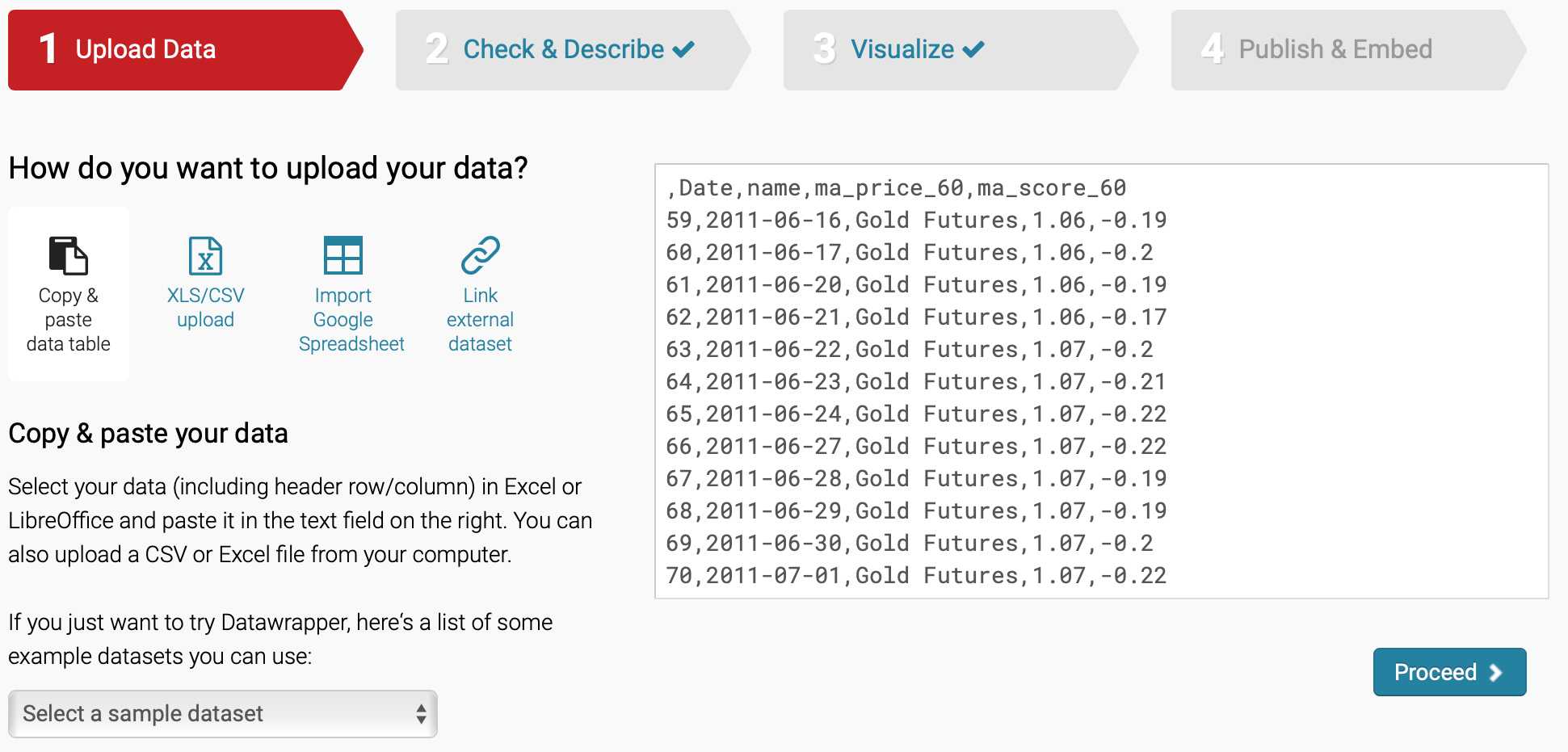
Data Preparation
You can simply upload your data unless you choose to copy & paste in the cells. In case you just wanna try it out, you can play with sample dataset provided by the Datawrapper team. After the data is successfully uploaded, the page is automatically refreshed and you can proceed to the next step.
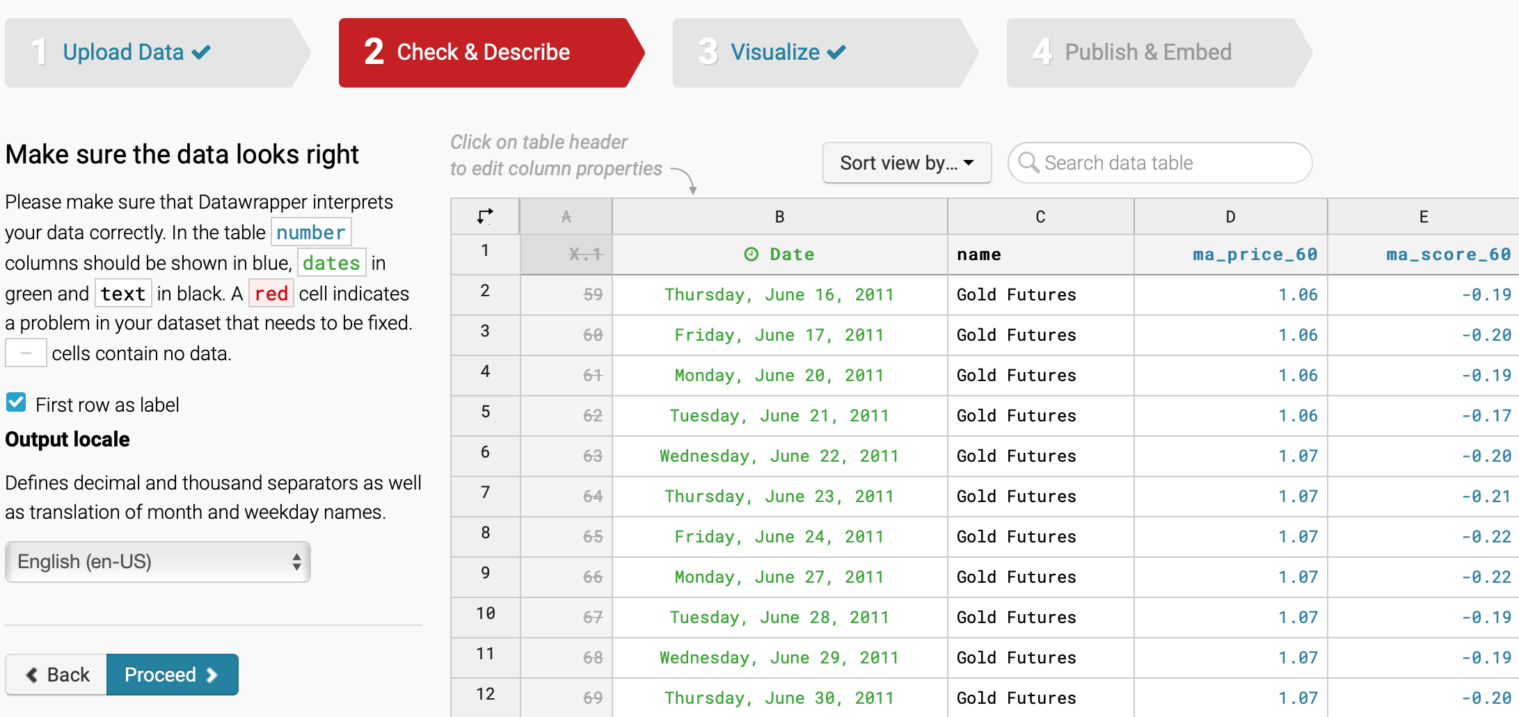
Verifying Dataset
In this stage, in addition to verifying if the dataset is in order, you might choose which columns you want to draw in your chart or sort the dataset.
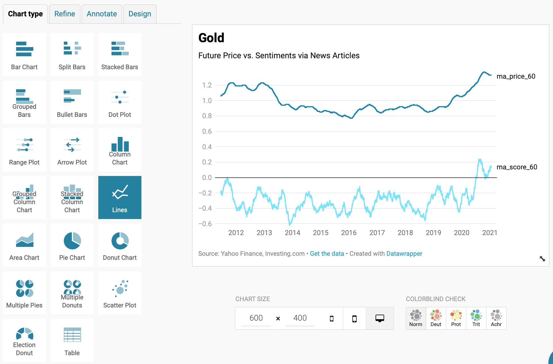
Create a Chart
Obviously, this is the core step in this creative activity. As such, you go through multiple stages before getting the chart. You choose chart type, axes and chart components setting, add captions and so on.
Chart type is where Datawrapper shines. It surely offers bunch of selections especially given that you can use this tool for free.
However, there's a caveat if you want to create a complex chart. Datawrapper team doesn't believe dual-axis is a good way of charting to viewers, therefore, it's out of the choice. It's the similar to the philosophy why seaborn doesn't provide stacked charts.
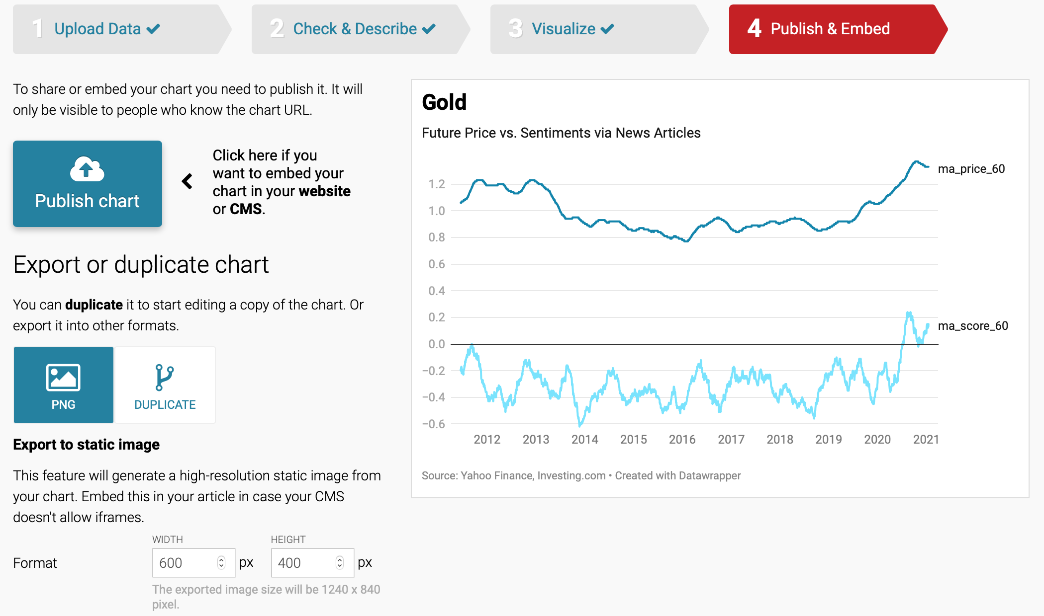
Publish or Save
As you finished creating the chart, you can either share to embed in a web page or save to graphic file (e.g., .PNG format). When you share it, you can fully make use of the interactive feature of the chart, while you loose that privilege otherwise, obviously (.PNG format is static).