Visualizing Seoul Metropolitan subway riderships
The visualization of the transportation usages is often one of the most commonly done by researchers. This involves a range of visualization techniques from simple scatterplot to more involved abstract graphs.
Motivation
Yesterday, by chance, I came across one phenomenal website, Visualizing MBTA Data (opens in a new tab), which made use of D3.js and pretty aesthetically appealing along with painstaking efforts involved. This intrigued me of making animated scatterplot using my favorite, Pydeck.
Initial method
After combing through gallery sections of Pydeck (opens in a new tab), I initially thought Pathlayer would do trick. On top of subway network lines, I might be able to draw stations with varying sizes according to the number of passengers.
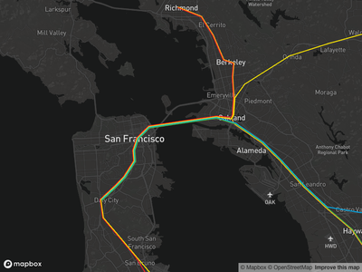 Source: https://deckgl.readthedocs.io (opens in a new tab)
However, it turned out that the subway network in the area was rather complicated and just looked like spaghettie noodles.
Workarounds
So, I found another viable solution which has been widely used, namely, Animated scatterplot. Rather than drawing entire lines of subway networks on top of geographic maps, scatters of stations with varying sizes according to passengers would be visually comfortable and easier to implement.

Drawbacks
Unfortunately, the data structure was not up to what we usually see globally, just like in famous MTA dataset. That is, it would have been much better if I could see daily usage changes, which wasn't possible due to data is only available on daily basis.
CC BY-NC 4.0 © min park.RSS